Get up to 25% OFF on all IT courses Enrol Now Only 20 Slots Remaining! Limited Time Offer!
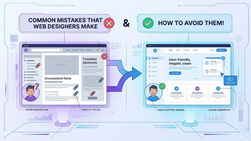
What are the most common mistakes that amateur web designers make? The most common amateur web design mistakes include poor mobile optimisation, cluttered layouts and more. To help you move from amateur to pro, this blog includes the 10 most common mistakes that new designers make and, more importantly, how you can fix them!
In web design, the first impression isn’t just important; it is more instantaneous than ever.
Research shows it takes about 50 milliseconds (that’s 0.05 seconds) for users to form an opinion about a website and decide whether they’ll stay or leave. Furthermore, 38% of people will simply abandon a site if the content or layout is unappealing or confusing.
As 88% of consumers are unlikely to return to a site after a poor user experience, most businesses are investing massively in this aspect. Fierce competition among companies to build appealing, high-converting websites has sharply increased demand for designers who can build or fix a brand’s digital presence.
While designing is about building functional and beautiful websites, many beginners keep repeating the same mistakes that increase bounce rates.
If you’re falling into common amateur traps, you are closing your doors to career-defining opportunities before you even get to the interview. To make your work truly stand out and align with the professional standards, you need to avoid a few design mistakes.
Keeping that in mind, we have created this blog post that dives into the 10 most common traps new designers fall into and, more importantly, how you can fix them.
Let’s get started!
It takes roughly 0.05 seconds for a user to form an opinion about your website. So, if you don’t want your amateur design mistakes to cost you real traffic, start working on your approach to improve your design skills.
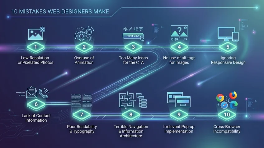
The following is the list of 10 design mistakes that most beginners make and how to fix them.
Nothing can turn off website visitors more than low-resolution, pixelated images. Including poor images on a site just breaks your design and makes it unappealing at first glance. Poor images include:
Poorly photoshopped images
Poor images don’t just look bad, it indicates a lack of professionalism and can make a brand seem untrustworthy. To maintain high standards and avoid this pitfall, you should use professional-grade photography or high-quality imagery.
Pro Tip: You can use SVG files for icons and logos to ensure they stay crisp at any zoom level.
Animation undeniably catches many eyes, but it’s appealing when used appropriately. It is a powerful tool, but it requires a delicate touch. While animation delights the visitor, using it excessively can become a distraction. Also, using more animations increases page load time, which also impacts SEO (search engine optimisation). This makes it one of the top skills to become a creative designer.
When overused, animations not only end up annoying and overwhelming the visitor but also lead to poor user engagement.
Pro-Tip: Use animation to guide the user’s eye to important elements, not just for decoration.
Including clickable calls-to-action (CTA) in a website design is standard and crucial. However, if used too much, it confuses or even bounces a prospective lead. This is also known as Hick’s Law, ‘the more choices you give a person, the longer it takes them to make a decision’.
The golden rule is to stick to providing a single yet appealing CTA on the home page. If you need a second one, make sure it looks less important so it doesn’t distract visitors from your main goal.
Pro Tip: Use a high-contrast colour for your primary CTA to create a clear visual hierarchy.
Alt tags or alt attributes are extremely vital, yet many amateur designers overlook them. These are not only vital for SEO, but alt tags are equally essential for legal compliance (ADA standards). Many businesses face lawsuits because their sites aren’t accessible to those using screen readers.
When images fail to load or are accessed via screen readers, the alt attribute provides necessary context in place of the visual. More importantly, this practice ensures web accessibility for visually impaired users and significantly improves your site’s SEO.
Pro-Tip: Write descriptive Alt Tags (e.g., “A male professor in a business suit delivering a live seminar in a classroom”) rather than focusing on adding the keyword.
As of the first quarter of 2026, mobile is now the primary way the world accesses the web, contributing 52.27% of total traffic (excluding tablet data). However, amateur designers often design solely for desktops. Ignoring mobile responsiveness of a site not only costs a business huge traffic but also leads to high bounce rates and a poor brand reputation.
When a website is not responsive, buttons become unclickable, and layout elements often overlap. More than user experience, search engines like Google penalise non-responsive sites in mobile search rankings. Therefore, making a website design that adapts to all devices is no longer optional; it is a fundamental requirement for modern web success, making it one of the top skills that every designer should learn.
Pro-Tip: Adopt a ‘Mobile-First’ mindset by designing for the smallest screen size first, then scaling up for tablets and desktops.
If customers fail or struggle to find a business’s contact information, they won’t trust the brand and leave the website within seconds. Amateur designers often overlook the right placement of contact details or bury them deep within internal pages. This lack of transparency makes a business appear untrustworthy or even fraudulent.
As a website is the digital store of any business, users expect to find a phone number, email, or physical address within seconds. Without clear contact points, a business loses the opportunity to convert interested visitors into actual leads.
Pro-Tip: Place your primary contact information in the global footer or the top right corner of the header to ensure it’s always accessible.
Amateur designers often prioritise fancy fonts over readable ones, which makes a website hard to use for visitors. Using small-sized, low-contrast, or too many decorative fonts strains the eyes and drives visitors away.
Typography is the backbone of a digital experience as it carries your message. It should be not only clear but smooth as well. Good typography should be seamless; it uses proper spacing and weight to deliver your message clearly.
Pro-Tip: Stick to a maximum of two font families and ensure your body text is at least 16px with a high contrast ratio.
If a user cannot find what they are looking for within seconds, they will leave for a competitor’s site. Many amateur designers overlook the importance of a logical hierarchy and bury essential pages under layers of unnecessary menus or categories. This messy structure makes it impossible for users to easily navigate the website, which leads to frustration and high bounce rates.
Furthermore, an illogical or disorganised structure of a website prevents search engines from crawling its content effectively, which can substantially damage its rankings. A well-organised website information architecture not only provides the social proof of a professional brand but also ensures a smooth user journey.
Pro-Tip: Follow the “Three-Click Rule”—ensure that any piece of vital information on your site is reachable within three clicks from the homepage.
We have all experienced the frustration of landing on a site only to be immediately blocked by multiple pop-ups. It is a common mistake that beginners make to launch intrusive overlays for discount codes or newsletter sign-ups before a visitor has even had the chance to read a single sentence on the site. However, this tactic often backfires, causing potential customers to bounce immediately.
Pop-ups should function as a helpful value-add, not just something that annoys visitors. Strategic timing and relevance are the keys to ensuring that your pop-ups feel like an invitation rather than an annoying interruption.
Pro Tip: Use “Exit-Intent” triggers to display pop-ups only as users prepare to leave, preventing annoying interruptions while they are still reading.
A common mistake that many beginners make is designing and testing a website only in their favourite browser. However, a website that looks flawless in Google Chrome might appear completely broken in Safari, Firefox, or Edge. This provides an unprofessional experience for a large portion of the audience who are using different browsers.
Every search engine processes CSS and JavaScript in a different way. If you want to be a professional web designer, you need to rigorously test across various platforms to ensure that every visitor sees the brand exactly as you intended.
Pro-Tip: Use cross-browser testing tools to verify your site’s appearance and functionality on multiple versions of all major web browsers.
Today, mastering web design is more than just working on aesthetics; it is more about understanding the right balance between user experience, technical performance, and visual communication.
By avoiding these 10 common design pitfalls that we discussed in this post, you can transform from a beginner into a professional asset.
See, UI/UX is a great career choice, but you need structured learning to master it.
Join the Karmick Institute, a reputed web designing institute in Kolkata, offering Vishlesan I-Hub, IIT Patna certified Web Design with UI/UX course. Get trained by experts who handle real-world projects every day and leverage 100% placement assistance to land your dream job in 6 months.
Want to master the industry-standard techniques used by top designers?
Start your journey toward creating world-class websites today.
Call: 9836423755 | 6289562294
Visit: www.karmickinstitute.com.
What’s the biggest UX mistake designers often make?
While there are many, ignoring mobile responsiveness is the biggest. As over 52% of web traffic comes from mobile devices, a site that doesn’t work on a phone is invisible to half the world.
Are UX designers getting replaced by AI?
No, but AI is changing the role. AI tools can help with coding and layout suggestions, but they lack the human touch required for strategic user experience (UX) and brand empathy. Designers who learn to use AI as a tool will be more in demand than those who don’t.
How to prevent web design mistakes?
To avoid web design mistakes, you need to focus on a ‘user-first’ mentality. Use high-resolution images, add clear CTAs (Call-to-Actions), and always test your site across multiple browsers like Chrome, Safari, and Firefox before launching.
How would you quickly define bad web design?
Bad web design is a combination of poor usability and unappealing aesthetics that bounce-back users from a website. A bad web design is characterised by slow load times, cluttered layouts, and non-responsive elements that frustrate visitors and drive them to abandon the site within seconds.
What is the “Three-Click Rule” in web design?
It is a navigation principle that suggests that any vital piece of information on your website should be reachable within three clicks from the homepage to prevent user frustration and bounce rates.
Why are Alt Tags important for more than just SEO?
More than making your website images understandable to the search engines, Alt Tags are essential for legal ADA compliance. They allow screen readers to describe images to visually impaired users, making your site accessible to everyone.
Can too many animations impact a website’s ranking?
Absolutely. Excessive animation increases page load times, making it slow. Since page speed is a significant SEO ranking factor, overusing animations can lower a site’s visibility in search results.
How can I tell if my website is cross-browser compatible?
You should never test your website on just one browser. Use cross-browser testing tools to verify that your CSS and JavaScript function correctly across all browsers, including Chrome, Safari, Firefox, and Edge.

Anirban is a seasoned UI/UX instructor who simplifies complex design concepts for learners. With many years of experience, he offers practical insights into current UI/UX trends. His practical approach helps learners to confidently build successful projects.